Saturday, April 23, 2011

Saturday, April 16, 2011
Aesthetic Choices
There were certain decisions in the making of our Teaser Trailer that were made for aesthetic reasons:
1) Not showing any form of violence or murder. This is because we knew that people have a certain feeling, a heightened sense of fear at the moment just before something bad happens. We wanted the audience to hold that feeling of fright just before the actual act occurs. We did this by purely because the film is meant as a teaser and should show nothing more.
2) Not showing who the villain is. This is because once again it is only meant to be a teaser and showing who the Antagonist is will be somewhat of an anti-climax.
3) Also we cannot see who the victims are which holds back a lot of identity about the plot of the film, locations, etc. Contrary to belief, it is actually important to make sure that the reader does not know any of this information as it subconsciously installs a sense of safety knowing there is no link between them and the victim.
If you listen to the trailer carefully there is a slight ticking noise that constantly occurs. Initially we stumbled across this yet i feel that it has actually become quite a vital part. It causes the audience to feel like there is a countdown to something, which is quite fitting in terms of a teaser trailer, which is essentially counting down to the release of a film.
Saturday, April 2, 2011
Feedback From Filming
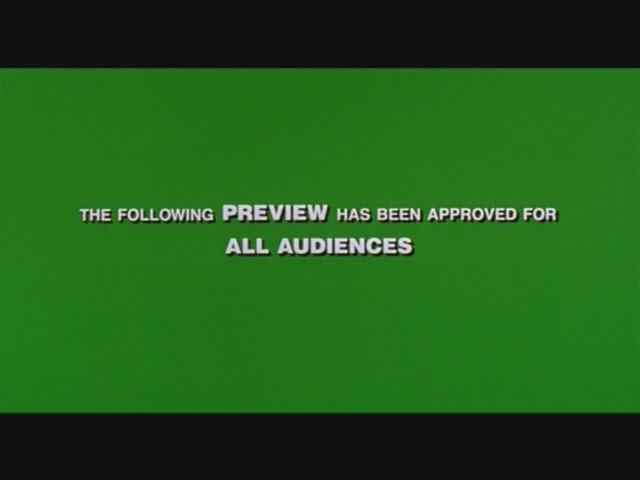
One of the biggest issues that we came across when receiving feedback about the film was that at the beginning there is too much black while the phone conversation is happening. To correct this we placed some production logos, slogans and an audio graphic to make sure that something was happening on the screen;
1) We put in a "Preview for all audiences" green screen at the beginning.

2) We inserted some production logos.


3) The Audio Graphic
1) We put in a "Preview for all audiences" green screen at the beginning.
2) We inserted some production logos.


3) The Audio Graphic
Saturday, March 26, 2011
Secondary Filming
This is the second edit of the trailer. Here we can see that the mistakes and comments from the first one have been put into place.
Wednesday, March 16, 2011
Feedback from Magazines
The feedback from the magazine basically said that the magazine was too blank. There is too much empty space on the right hand side so i plan to fill that side with logos for up and coming new films that i can also advertise. Also the fonts on the left hand side of the image looked too "amateur" so i will make them bold and italic. Also as there is was a lot of space to fill in, I will enlarge the image.
Friday, March 11, 2011
Feedback from Posters
Here is a list of the comments that was made about our posters;
"It is very realistic and although i am a bit wary of the title design, i think that it looks wonderful"
- Jo Hamilton
"I love it, very professional!"
-Kerry Goodwin
"When i first saw this poster i thought it was for an actual film! I'm stunned"
-Chris Burton
Due to the positivity of there comments we have decided that we will not be changing anything about the poster.
Tuesday, March 1, 2011
Poster designs

We designed this straight from the word go and have received nothing but good comments about the poster.
To do this we compared ours to others such as the poster for Fightclub and Scream 4;


Subscribe to:
Posts (Atom)